
How to Optimize WordPress for Mobile Devices
Is your website mobile-friendly? Do you want to learn how to optimize WordPress for mobile devices? In this article, we will teach you eight ways to make your website look better on mobile devices.
But first, let’s start with why optimizing WordPress website for mobile are a good idea.
Why Must We Optimize WordPress for Mobile Devices?
You should optimize WordPress for mobile devices because most people have started using mobile devices for surfing the internet.
If you look around, almost everyone, including kids, carries some mobile device. You’ve probably already done everything to get people to visit your website, like generating better content, improving your SEO, and so on. Mobile device optimization will help you gather more visitors.
About 60% of internet users used mobile devices to browse sites in 2022.
That means more than half of people use phones and tablets instead of desktops and laptops. To keep up with them, your website should be capable of displaying on any screen size. A design that works well on mobile devices will improve the user experience and help them find what they need without the hassle.
Now you know why it is crucial to have a mobile-optimized WordPress website. Next, let’s see how to test whether a website is optimized for mobiles.
How to Run Mobile Friendly Test?
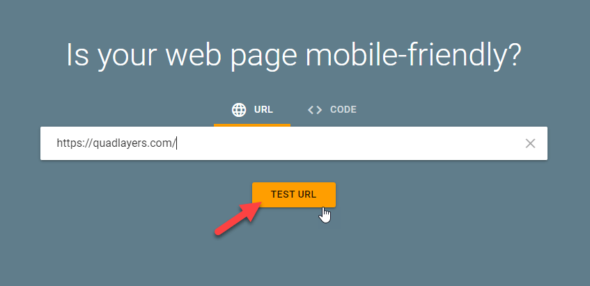
To optimize WordPress for mobile, you should first test your site’s mobile friendliness. You can use Google’s Mobile-Friendly test tool to test whether your site is mobile-friendly.

Enter your site URL and click on “Test URL.”
After a few seconds, you will see the result:
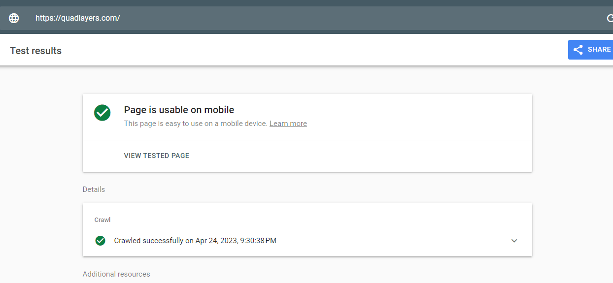
If your site is mobile-friendly, the test will show that the “Page is usable on mobile.” If not, let’s learn how to do it.
How to Optimize WordPress for Mobile Devices
We have eight ways to improve your WordPress website and optimize it for mobile devices:
- Using a responsive theme
- Use mobile-friendly plugins
- Optimize images
- Improve the website’s speed
- Typography
- Limit pop-ups and pop-unders
- AMP
- A good web hosting provider
Now, let’s look at each of them and see how it helps with the optimization.
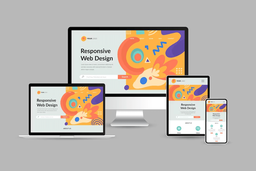
1) Use a Mobile-Friendly Theme

The first thing you need to do to optimize WordPress for mobile is to make it adapt to different screen sizes.
This is called a responsive design.
Almost every theme available in the WordPress repository is responsive. Most WordPress theme companies will include a demo website to test the theme’s features. You can check the demo website before purchasing the theme.
If you need to learn more about mobile-optimized WordPress themes, check out this post.
2) Use Mobile-Friendly Plugins
There are no issues if you don’t have a responsive WordPress theme. One of the best things about WordPress is that it has plugins that make the website owner’s job much easier and more organized. You can use these plugins for many purposes, including making WordPress sites mobile-friendly.
As a site owner, you’d rather spend your time and money on your site’s content than on all the technical terms that go on behind the scenes to make it work, right? With a simple plugin, you can make your site’s content easy to read on phones, so people don’t have to zoom in a thousand times or scroll from left to right to read a paragraph.
Like with themes, pay attention to the plugin’s features and try to read reviews or search for a demo before buying one. And every time you activate a new plugin, do a quick quality check of your site to ensure it fits all screen sizes correctly.
3) Use Optimized Images

Whether you’re dealing with a blog, a portfolio site, or an eCommerce site, consider checking out the media files and ensure they aren’t causing any problems in the front end.
That large background image on your site may seem fantastic on a desktop, but if it doesn’t scale properly, it may lose all contexts and result in a terrible viewing experience on mobile phones.
So what is the first rule of responsive media?
It is how things scale.
If scaling isn’t the best solution for your site, consider hiding some elements when visitors load your site on a mobile device. This would make things easier for users and help them access the most critical information faster.
Lastly, it would be best to consider the file size of the media you add to your site. This will not only make the mobile experience better, but it will also make the loading time faster. If the media files on a website are bigger, they cause longer loading times, which is terrible for SEO and conversions.
4) Site Performance
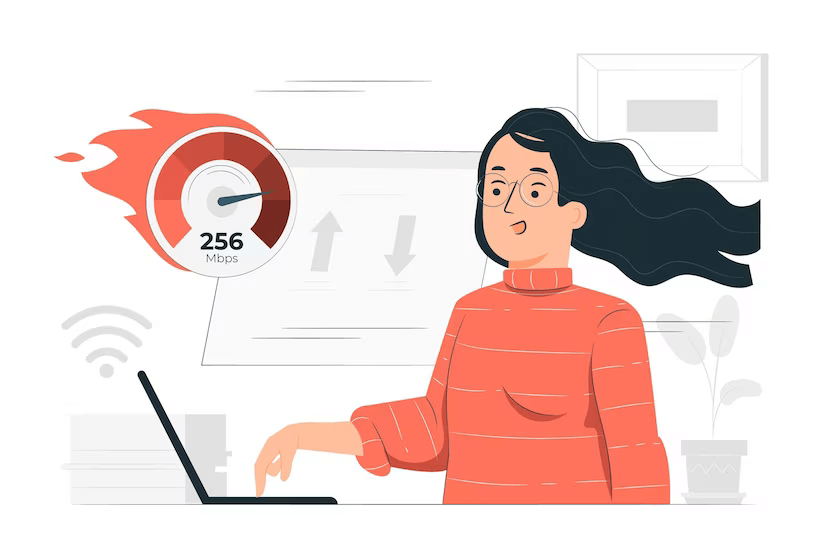
Page speed has always been a factor in how Google ranks your site for desktop searches. It also determines how it ranks your site for mobile searches. So if you need to get better results in mobile SERPs, you should consider making your website faster.
Images play a significant role in site performance. You can quickly solve this issue with a suitable WordPress image compression plugin—when it comes to website speed, your WordPress hosting and the installed plugins matter.
Actions like minification also play an essential role in your code. Minification is a simple process that involves optimizing the HTML, CSS, and JavaScript code.
5) Typography

Choosing the right font and font size is essential. Several font hosting services are available, like Google Fonts, Adobe Typekit, etc. There, you can see hundreds of thousands of free/premium fonts. You can choose a font that will look good on mobile devices.
Once you have selected a font, you can preview how it will look on your website.
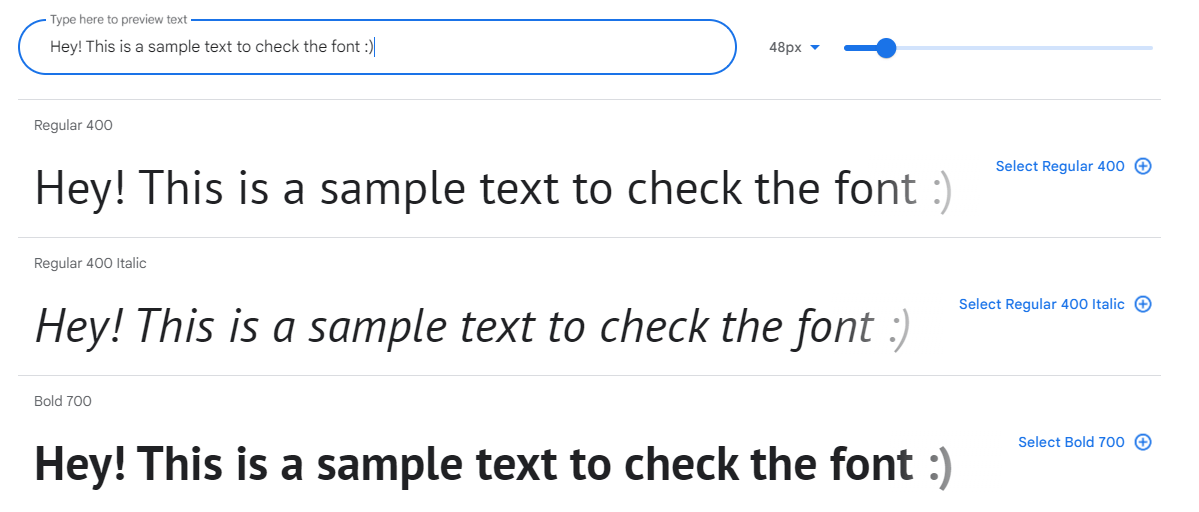
Also, ensure you use the correct font size, weight, and line height. All these things can be customized with a bit of CSS code through the WordPress customizer.
6) Avoid Using Pop-Ups

Another easy option to optimize WordPress for mobile is to limit aggressive Pop-Ups on mobile devices, especially on the first page. Google has begun penalizing sites that use invasive interstitials (opt-ins) that cover a site’s content. This includes pop-ups that appear immediately or after some time, and any other opt-in, a user must close before seeing the page’s content.
You have to avoid pop-ups to make your WordPress site mobile-friendly. This can help you with the optimization process.
7) Google Accelerated Mobile Page

Google’s search algorithm has taken page speed into account for a long time.
Google always tries to give users the best experience possible using a computer or a mobile device. And for the same reason, they created Accelerated Mobile Pages (AMPs), which help web pages to load faster on mobile devices.
Page speed is a search ranking factor, and AMP makes mobile web pages rank higher. So, it’s true that AMP helps your website move up in the SERPs. Using the right AMP WordPress plugins, setting up AMP on your WordPress site is easy.
8) Reliable Web Host

All the decision you make to optimize WordPress for mobile means nothing if you have selected an unreliable web hosting provider.
You should avoid shared hosting plans if you have a website that receives decent traffic. Someone else’s massive traffic spike could also take your site down when you run on the shared hosting plan. Always ensure you’re working with a good company that offers services like in-house caching technology, a content delivery network (CDN), and good infrastructure.
If you need to learn more about web hosting providers, check out this article.
That’s it!
With these methods, you can optimize your WordPress website for mobile and make more conversions.
Bonus: Tips to Increase Site Speed on Mobile
There are many ways to increase site speed on mobile devices. Here are some of the resources you can use to optimize site speed;
- Defer JavaScript: Deferring JavaScript parsing can help you load important files faster for the First Contentful Paint (FCP). With a dedicated WordPress caching plugin, you can complete this task.
- Removal of Render Blocking Resources: Eliminating Render Blocking Resources can help you render the FCP of your site faster.
- Turn-on Keep-Alive: If you enable Keep-Alive, your server will deliver the file in the best way possible. This way, you can reduce the HTTP requests.
- Gzip Compression: If you enable Gzip compression, it will deliver small and compressed files from the server. It is a highly efficient way to boost your website’s speed.
Conclusion
An optimized WordPress site for mobile devices is crucial, considering the statistics. Your website visitors and search engines want your site to work correctly on mobile devices. Apart from using a mobile-friendly/responsive WordPress theme, you can also do multiple things like adjusting the font size, optimizing the images, etc.
This article showed you eight elegant ways to optimize your WordPress website for mobile visitors:
- Using a responsive theme
- Use mobile-friendly plugins
- Optimize images
- Improve the website’s speed
- Typography
- Limit pop-ups and pop-unders
- AMP
- A good web hosting provider
Following these methods could improve the overall user experience and conversion rates. We hope you found this article helpful and learned how to optimize WordPress for mobile devices. If you did, please consider sharing this post with your friends on social media. It will help them to improve their website.
Are you using any of these methods to make your WordPress site mobile-friendly?
Do you know any other way to optimize WordPress for mobile?
Tell us in the comment section below.
Articles you might want to check:

I was very much delighted to read your article. Creating a responsive and mobile-friendly WordPress site is crucial in today’s mobile-driven world. Here are some steps to help you achieve that:
1.Choose a mobile-responsive theme
2.Install a mobile optimization plugin
3.Optimize images for mobile
4.Use a responsive design framework
5.Test your site on mobile devices
6.Simplify navigation
7.Optimize loading speed
By Implementing above points we can create a Responsive and Mobile-Friendly WordPress Site. Readers, if you want to develop your wordpress website, you can visit an IT company like Alakmalak technologies. They have 17+ years of experience in this field.