Do you want to have a great menu on both desktop and mobile? We’ve got you covered. In this guide, we’ll show you how to match the desktop and mobile menus of your WordPress website.
The usage of mobile devices to browse the internet has been increasing in recent years. However, not all sites are designed to provide users with a good experience on mobile. To keep up with the times and make the most of your mobile visitors, you should make sure that your site is as responsive on mobile as it is on desktop screens.
Before showing you how to match the desktop and mobile menus, let’s first have a look at why having the same design is a good idea.
Why Match your Desktop and Mobile Menus?
Even though it’s more and more common that users browse the internet from their phones, not all websites are designed to provide mobile users with a good experience. To make sure that your site is easy to navigate on any device, you should match your desktop and mobile menu so it looks appealing on every screen.
Currently, most websites have header menus that look good on desktop screens. However, the same doesn’t happen on mobile screens. Many website owners use the default options for mobile, so the menus usually don’t look as good.
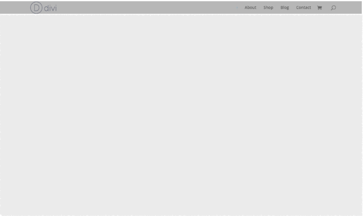
Let’s have a look at an example. Let’s say your website has a standard menu on desktop with a height of 30px and a maximum logo height of 100px.
If you check the same menu on mobile without any changes, it will look like this.
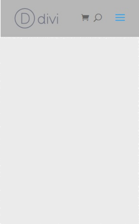
As you can see, it’s quite big and would take up nearly 20% of the screen. The good news is that you can make some adjustments to match the desktop and mobile menu, so the latter will look like this:

Matching the desktop and mobile menus is a must if you want to provide users with an excellent experience on screens of any size. Additionally, a good-looking and fully responsive website can also help them navigate your site and increase engagement.
Now that you better understand why you need to match the desktop and mobile menus, let’s see how to do it.
How to Match your Desktop and Mobile Menus in WordPress
Matching your desktop and mobile menus is not a complicated process. All you need to do is follow the steps we’ll see below. Keep in mind that we’ll use a bit of CSS code to style our menus, but you will be able to follow the guide even if you don’t have coding skills.
For this tutorial, we’ll use the Divi theme as it is one of the most responsive, easy-to-use, and feature-rich themes in WordPress. Some of the interfaces may vary depending on the theme you use for your website but you should be able to apply most of the changes on any theme.
1. Configure the Menu
The first thing you should do to match the desktop and mobile menus is to configure the menu. This will be the same for most themes. Here, we will adjust the height for the menu and logo.
In your WordPress dashboard, go to Appearance > Customize. You will be redirected to the Theme Customizer where you’ll need to open Header & Navigation > Primary Menu Bar.
Then, make sure that you disable and uncheck the Hide Logo Image option and adjust the height of the menu and the maximum height of the logo as follows:
- Menu Height: 30
- Logo Max Height: 100
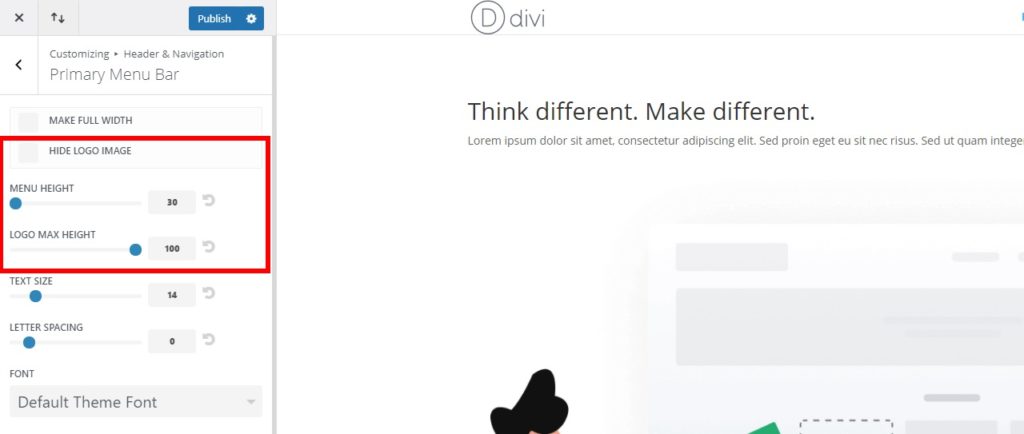
This will decrease the height of the menu for both desktop and mobile, making it more elegant and creating more space on mobile screens.
Once you have set the values, publish it.
2. Edit the Menu with CSS
After you have configured the logo and menu, you can start editing the menu with CSS. There are different ways in which you can add CSS to WordPress to match the desktop and mobile menus. You can either add them on a single particular page or to the entire website.
To keep the design consistent, we recommend you apply the CSS changes on the menu to the whole website. However, you can also include CSS code on particular web pages if needed. We will show you both options below.
Before we start, it’s a good idea to backup your WordPress site. We’ll add some lines of code to the site, so it’s always handy to have a recent backup in case you want to go back to a previous version of your website.
2.1. Add CSS Code to a Single Page
To add CSS code to match the desktop and mobile menus for one specific page, open the page from your WordPress dashboard.
Then, open the page with the Divi Builder and click on the Options button at the bottom of the page (the 3 horizontal dots). There you will see the page options. Click on the Settings icon to open the Page Settings, head to the Advanced tab, and press Custom CSS.
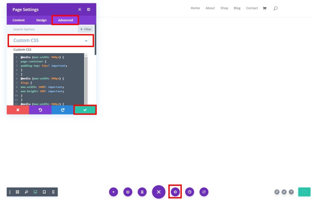
After that, add the following CSS code and click on the tick mark to save it.
@media (max-width: 980px) {
# page-container {
padding-top: 43px! important;
}
}
@media (max-width: 980px) {
#logo {
max-width: 100%! important;
max-height: 90%! important;
}
}
@media (max-width: 980px) {
#mainheader {
top: 4%! important;
}
}
@media (max-width: 980px) {
# et-top-navigation {
padding-top: 5px! important;
}}
.et_header_style_split .mobile_menu_bar,
.et_header_style_left .mobile_menu_bar {
padding-bottom: 5px;
}
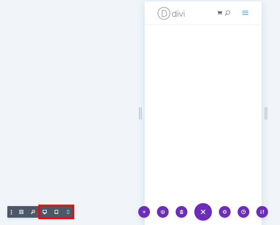
You can compare the results between desktop and mobile using the preview modes available in the builder. You will see the options on the bottom left of your screen.
2.2. Add CSS Code to the Whole Website
Alternatively, you can add CSS code and apply it to the whole website. This is the most common technique as it will help you maintain consistency across the site and match the desktop and mobile menus on every single page.
For this, you can add custom CSS in two different ways:
- Using the Theme Customizer
- From the Theme Options (If you use Divi)
Let’s have a look at both options.
i. Theme Customizer
In your WordPress dashboard, go to Appearance > Customize and open the Theme Customizer. Then, go to the Additional CSS tab.
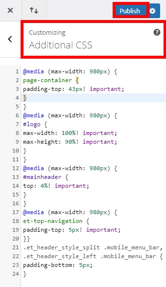
Paste the following CSS code and publish it.
@media (max-width: 980px) {
# page-container {
padding-top: 43px! important;
}
}
@media (max-width: 980px) {
#logo {
max-width: 100%! important;
max-height: 90%! important;
}
}
@media (max-width: 980px) {
#mainheader {
top: 4%! important;
}
}
@media (max-width: 980px) {
# et-top-navigation {
padding-top: 5px! important;
}}
.et_header_style_split .mobile_menu_bar,
.et_header_style_left .mobile_menu_bar {
padding-bottom: 5px;
}
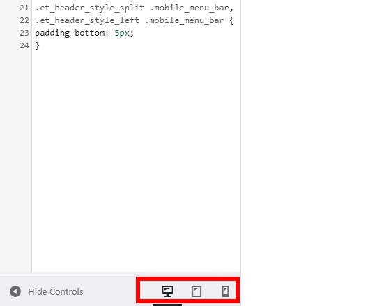
After you have pasted the CSS code, you can also adjust the values to meet your site’s requirements. Make sure that the top padding between the mobile menu and the logo is aligned properly. If you’re not sure what the right values should be, start with high values and decrease them until you’re happy with the result.
The good thing about this method is that you can preview the results for desktop and mobile from the Theme Customizer. The preview mode options will appear on the bottom left of your screen.
ii. Theme Options
Alternatively, if you use Divi you can add CSS code to your whole website using the theme options. This might be an easier and faster approach as you won’t need to load the Theme Customizer to add the code.
First, go to Divi > Theme Options and open the General tab. Then, scroll down to the bottom of the page and you will find the Custom CSS.

Once again, add the following code to the text box as shown in the screenshot and save the changes.
@media (max-width: 980px) {
# page-container {
padding-top: 43px! important;
}
}
@media (max-width: 980px) {
#logo {
max-width: 100%! important;
max-height: 90%! important;
}
}
@media (max-width: 980px) {
#mainheader {
top: 4%! important;
}
}
@media (max-width: 980px) {
# et-top-navigation {
padding-top: 5px! important;
}}
.et_header_style_split .mobile_menu_bar,
.et_header_style_left .mobile_menu_bar {
padding-bottom: 5px;
}
Keep in mind that this is just sample code, so you may need to adjust it to match your site’s design.
Some Additional Tips for Mobile Menu
We’ve just seen how to easily match the desktop and mobile menus on your website. But there’s more you can do to customize your mobile menu. In this section, we will show you some of the most common customizations you can perform to make the most of your menu.
Keep in mind that we have used the Divi theme for this tutorial, so some of the options might be slightly different depending on the theme you use.
1. How to Make the Mobile Menu Fixed
One of the best modifications that you can do to your mobile menu is to make it fixed when users scroll on your website. This can improve navigation and improve user experience on your site.
To make the mobile menu fixed, add the following CSS code in the Theme Customizer or the Theme Options.
@media (max-width: 980px) {
.et_non_fixed_nav.et_transparent_nav # main-header, .et_non_fixed_nav.et_transparent_nav # top-header, .et_fixed_nav # main-header, .et_fixed_nav # top-header {
position: fixed! important; }}
For more information on how to make the menu sticky in Divi, have a look at this guide.
2. Add a Different Logo for Mobile Mode
This can be useful if you are having a hard time getting the correct values to make the perfect alignment for your mobile menu. You can simply replace the original logo and have a different logo with a more appropriate size only on mobile devices.
To use a different logo on mobile, first, upload the logo image on your website. Go to Media > Add New and upload your image.
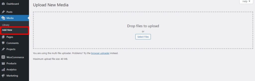
Then, head to the Library tab and select the image. If you have already uploaded the image you can just open Media > Library.
Now select the image and copy the File URL.

Finally, add the following custom CSS on the Theme Customizer under Additional CSS and publish it. Remember to replace the URL with the one you’ve just copied.
@media only screen and (max-width: 981px) {
/ * Changes mobile logo to specified image * /
#logo {
content: url ("http://site.com/logo.png");
}
}
3. Hide Logo in the Mobile Header
If you’re having issues matching the desktop and mobile menus, you may want to make them different and hide the logo on mobile altogether. This can be a good option for some sites, but make sure that you offer other cues so that users can identify your website even without the logo.
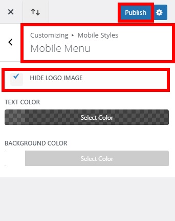
To hide the logo from the mobile menu, in your WordPress dashboard go to Appearance > Customize and open the Theme Customizer. Then, navigate to Mobile Styles > Mobile Menu. Check the Hide Logo Image option and publish it.
That’s it! The logo will be hidden on mobile.
Conclusion
All in all, it is essential that your website looks good and is functional on any type of device. Matching desktop and mobile menus will allow you to improve your site’s navigation and provide visitors with a better experience.
In this guide, we have shown you the different steps to have the same menu on both desktop and mobile. We’ve seen how to configure it and edit it with CSS either for a single page or for the whole website.
Additionally, we have also provided you with some tips to customize the mobile menu. Considering that nearly half of the traffic on the Internet is mobile, this can have a big impact on your site.
If you want more information on the Divi theme or builder, you can have a look at these guides:
- How to customize the Divi menu with CSS
- Make a Divi header (sticky/fix)
- How to hide and remove the footer in Divi
Have you matched the desktop and mobile menus on your site? Did you have any issues following the tutorial? Let us know in the comments section below!

Hi!
How do i make this without wordpress? I would like to do it with html/css and maybe javascript…