
How to Create a Mobile Responsive WordPress Menu
Have you ever wanted to create a mobile responsive WordPress menu? You might have seen websites that have done it, but you’ve never been able to do it on your own. If yes, this article is for you because today, we’ll show you very easy ways to create and customize a mobile menu for your WordPress website.
But before we start, let’s see what is a mobile responsive menu in detail, along with its benefits.
What is a Mobile Responsive Menu?
A mobile responsive menu is a drop-down menu that is specifically designed to work on mobile devices such as smartphones and tablets. This type of menu is usually triggered by tapping on a hamburger icon, and it allows users to navigate your site without having to scroll through a long list of links.
If you’re looking to create a mobile responsive menu for your website, there are a few things you need to keep in mind.
First, you need to make sure that your menu is easy to use on a touch screen. This means that your links should be large enough to tap on, and they should be spaced out so that users don’t accidentally tap on the wrong link.
Secondly, you also want to make sure that your menu collapses automatically when not in use so that users don’t have to scroll through it when they’re not looking for something specific.
Finally, you need to consider how your mobile responsive menu will work with the rest of your website. If you’re using a separate mobile version of your site, you’ll want to make sure that your menu links redirect users to the appropriate page. But if you’re using a responsive design for your entire site, then keep in mind that your menu works well with the rest of your content.
Why We Must Create a Mobile-Responsive Menu?
Mobile responsive menus are becoming increasingly popular as more and more people use their mobile devices to access the internet. The main reason to create a mobile responsive menu is to improve the user experience for your mobile visitors. A mobile responsive menu makes it easy for visitors to find what they are looking for, whether they are using a smartphone, tablet, or desktop computer.
Besides that, there are a few reasons why you would want to create a mobile responsive menu.
First, it can make your website more user-friendly for mobile users. Second, it can help you save space on your mobile device, as the menu will take up less space than a traditional menu. Third, it can help you improve your search engine optimization (SEO), as mobile users are more likely to click on a link that is easy to see and navigate.
Not only that, but because of the easy navigation, people tend to stay longer on your site resulting in reduced bounce rates.
So, how can you create a mobile WordPress responsive menu? It is pretty easy to do so.
How to Create a Mobile Responsive Menu?
There are a few different ways you can create a mobile responsive menu. The easy way, of course, is to use a plugin. There are many plugins available that will allow you to create a mobile responsive WordPress menu. Alternatively, you can also manually create your own mobile responsive menu using CSS and HTML.
WordPress has several free and premium plugins that will let you create a fully responsive mobile menu. Here, let’s take a look at a couple of user-friendly and popular plugins first.
Responsive Menu
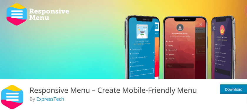
Responsive menu is one of the best plugins to transform your standard WordPress menu into a completely W3C-compliant design that is mobile-ready.
With this plugin, you do not need any coding knowledge. You can create a responsive menu by combining more than 22,500 selections with more than 150 customization options. With highly customizable features and intuitive UI, you can create the menu of your choice instantly.
Key Features
- Change fonts and colours
- Add a search bar
- One-click import and export the menu
- Different animation options
- Preview the changes
Pricing
Responsive Menu offers both free and paid versions. The Pro version starts from $49 per year.
WP Mobile Menu Plugin
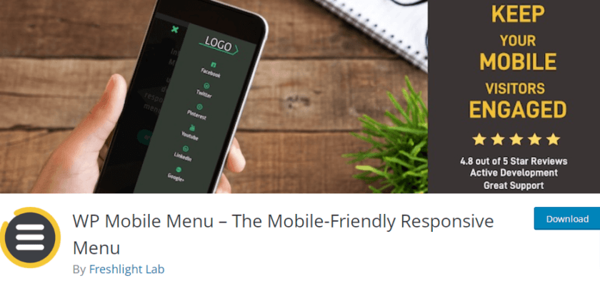
WP Mobile Menu is a mobile-responsive WordPress menu plugin that lets you build stunning menus for your website. You may make a naked header, a menu with three levels of depth, overlay masks when the menu is active, and much more to keep your users interested.
Additionally, you can submit text or image-based logos and add backdrop pictures. With the premium version of this plugin, you can display mobile menus on particular pages, add a header live search, and add footer menus.
Key Features
- Disable the menu for specific pages
- Allow visibility of the menu to the logged-in users only
- Select types of menu display
- Includes copyright section
- Alternative menus on a different page
Pricing
WP Mobile Menu also comes with both free and premium versions. Starting price of the premium version is $6.49 per month. Besides, you also get a 14-day unconditional money-back guarantee.
So, these were a couple of top-notch responsive menu plugins for WordPress. Next up, we will see two methods to create mobile responsive WordPress menus:
- Using a Plugin
- Programmatically
So, without any further ado, let’s get started.
1. Create a Mobile Responsive Menu Using WP Mobile Menu Plugin
For this demonstration, we will use the Responsive Menu plugin, as it is available for free from the WordPress.org repository and is easy to use.
Before you start, you’ll need to install and activate the plugin on your site.
1.1 Install and Activate Responsive Menu Plugin
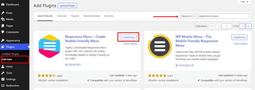
First, click Plugins > Add New from the WordPress admin panel. Use the search bar on the page to look for the plugin’s keywords.
To begin the installation process, click the “Install Now” button when you’ve located the plugin you want. Afterwards, to begin using the plugin, click the “Activate” button.
1.2 Create the Mobile Menu
Once you have installed and activated the plugin, you can find the plugin setting inside the WordPress Dashboard. There you can find 3 different options: Menus, Settings and Themes.
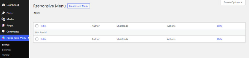
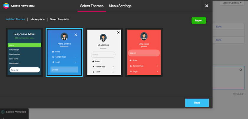
Upon clicking on the Menus option, a new page will open where you can find a button “Create New Menu“. Now you will see a new window where you can select between various menu templates. On the free version, you get four different templates. After selecting the template of your choice, click on “Next“.
Then, you’ll be redirected to the menu settings. Here, you can add a descriptive name to your menu so that you can identify the menu later.
You can also link the WordPress menu to map with your existing menu. Another setting option is to hide the default menu of the existing theme by adding a valid CSS selector. We’ll see how we can hide the default menu in a while.
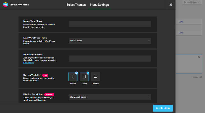
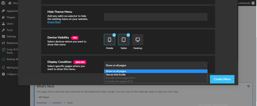
Next, Select the devices where you want to display the menu. If you are using the pro version, you’ll get to select Mobile, Tablet and Desktop. But in the free version, only Mobile and Tablet options are available. Finally, you can select different conditions to display the menu. Again this option is available on the Pro version.
After filling out the fields with the required details, click on the “Create Menu” button. This will again redirect you to the page where you can customize the menu.
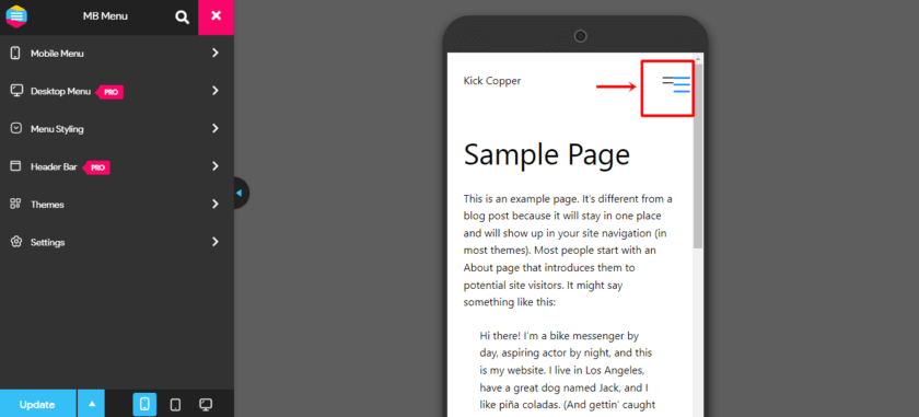
But as you can see, a newly created menu is overlapping the original menu. Now, with a few further steps, we can hide the original menu completely.
1.3 Hide Default Menu
As we saw earlier, if the original WordPress menu is not hidden, it is displayed by default alongside the new Responsive Hamburger Menu (and occasionally overlaps it). Therefore, you must manually hide the menu. For that, go to Settings > General Settings in your Responsive Menu Plugin. The option to hide the theme menu is located here.
You can conceal your current theme menu by inserting the CSS selector in the field.
Now before adding the right CSS, we must find out the right id or class. For that, right-click the original menu and select “Inspect Element“, which will reveal the original Menu Selector.
In the Hide Theme Menu Field, paste code like this: class=”toggle” or id=”main-mobile-menu” with the prefix “#” for the id or a “.” for the class selector.
For instance, you would write #main-mobile-menu in the Hide Theme Menu area if the selector was id=”main-mobile-menu”.
In our case, our selector is a class. That’s why we have pasted it and added “.” before the code. After pasting the selector along with the prefix, make sure to click on the Update button.
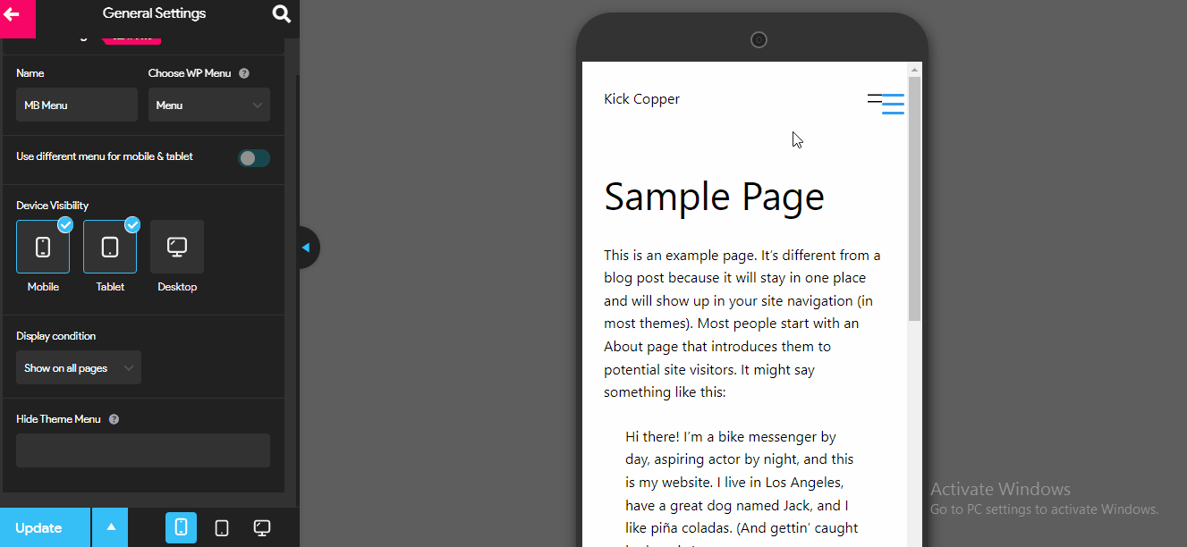
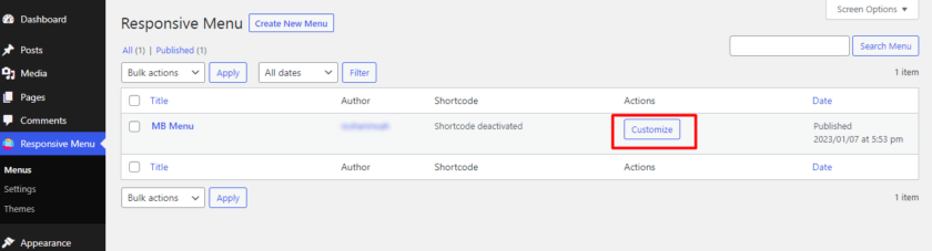
1.4 Customize the Mobile Menu
After successfully adding the menu, you can customize the menu according to your liking. You can find customization settings from Responsive Menu > Menus. There you can find a newly created menu. As you can see, there is a button which says “Customize“. Simply click on that button.
Inside the customization options, you can change the button position, menu colour, image and background. Not only that, but you can also add customized CSS in the Menu Breakpoint option, which lets you select the screen width required for the Mobile Menu to be activated. By increasing the breakpoint width, it is possible to have the mobile menu display on the desktop screen as well.
2. Programmatically Create a Mobile Responsive Menu
In this section, we’ll have a look at creating a responsive menu for your website programmatically. So, if you are confident with coding and editing core files, this method is great for you.
2.1. Adding Custom Code Snippets to WordPress
Before we go into the actual method, to ensure that there are no conflicts with any plugins or scripts, we always advise generating a backup of your complete website before making any changes to the core files.
To add custom code snippets, you can either utilize a plugin like Code Snippets or paste the snippet straight into the functions.php file of your child theme because this method requires inserting custom codes.
To get started, you can either manually create a child theme or use a child theme plugin, depending on your preferences. For this tutorial, we have created a child theme using the WP Child Theme Generator plugin.
2.2. Code Snippet to Create a Mobile Responsive WordPress Menu
Once your child theme is created, paste the following code to the functions.php. Alternatively, add the following code to your CodeSnippets plugin and activate the snippet.
function twenty_twenty_child_style_setup() {
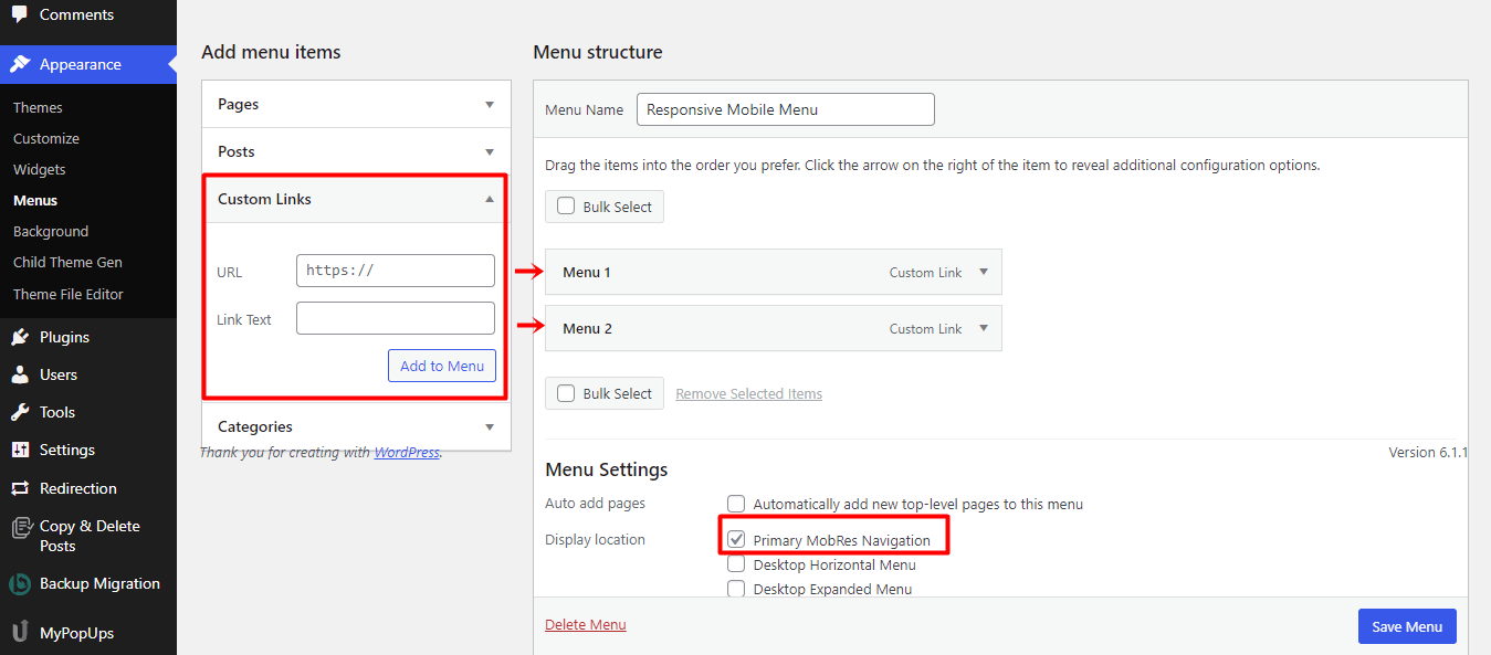
register_nav_menu( 'primary-res-navigation', __( 'Primary MobRes Navigation', 'twenty_twenty_child_style_setup' ) );
}
add_action( 'after_setup_theme', 'twenty_twenty_child_style_setup' );
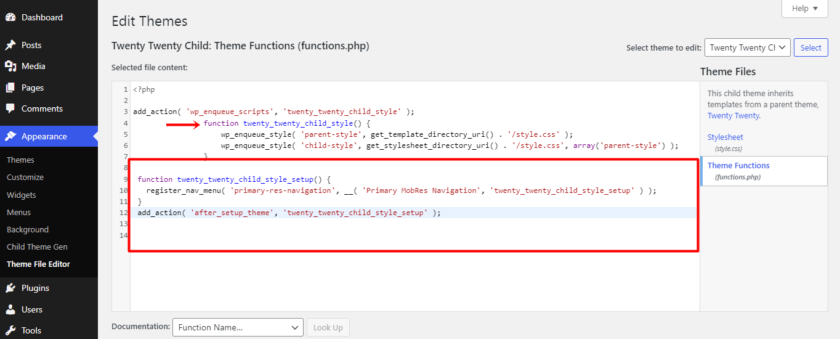
Here we have named the new responsive custom menu “primary-res-navigation” by using the twenty-twenty-child setup method. And for the WordPress function, we’ve used “register_nav_menu”. When you add this code to your function.php, as demonstrated in the screenshot below, you’ll be able to view a custom menu in the WP admin section.
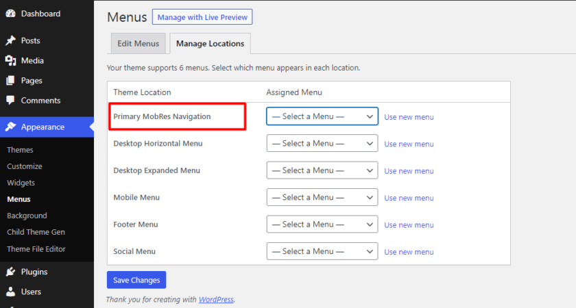
Because the custom menu serves as the major header menu, you must add another custom code to enable the display of the primary-res-navigation menu. Simply add the line of code that follows:
wp_nav_menu( array( 'theme_location' => 'primary-res-navigation', 'menu_class' => 'nav-res-navigation' ) ); ?>
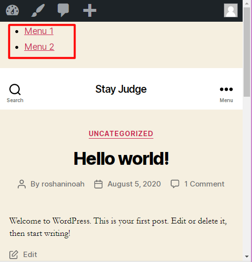
Then, just click over to the admin menu, create a new mobile menu, and then add the custom links you wish to appear on the mobile menu. All of these should be connected to your main mobile menu theme location.
Upon previewing, this is how your menu will look, depending on the theme you are using.
Once the new custom menu has been added, you want it to only appear on mobile devices and not on desktop computers. In this case, we can use CSS media queries. Simply add the following line of code to style.css to prevent the mobile menu from appearing by default:
.nav-res-navigation { display:none; }
Next, you should only show the primary-res-navigation menu when the website is being viewed on mobile screens and conceal the main menu. You might also be interested in adding a border with a different design to your menu. To make your menu better, you should add the code snippet below to your style.css file.
@media only screen and (max-width:500px) {
.nav-res-navigation{
display:block;
}
.nav-res-navigationa{
background:#333;
color:#800000;
padding:10px0;
text-align:center;
display:block;
}
.main-nav-menu{
display: none;
}
}
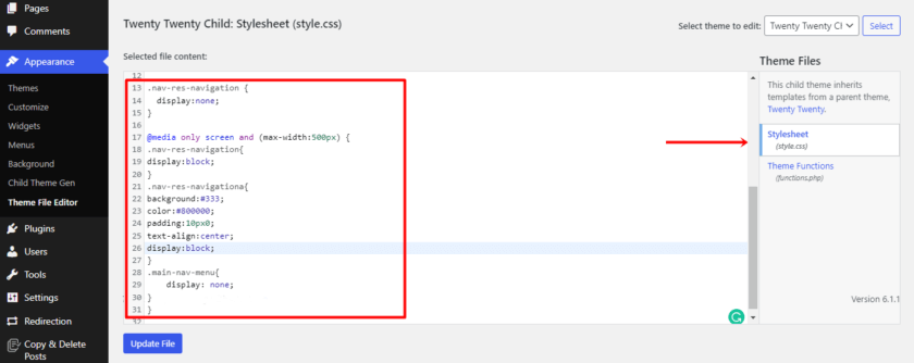
With this code, the main menu will remain hidden, and the menu will only be displayed on a small screen.
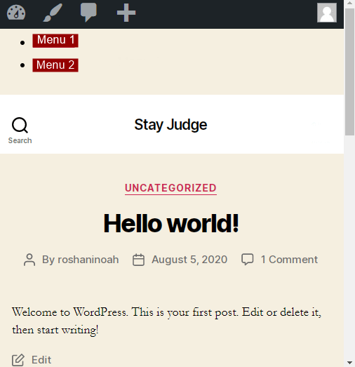
And that’s it. With these simple and easy steps, you can create a mobile responsive WordPress menu using custom codes.
Conclusion
Creating a mobile responsive menu makes your site more accessible to mobile users. With a mobile responsive menu, your site will be easy to use on a smaller screen and will still offer all the same features and functionality as it does on a desktop computer.
In this article, we discussed how we can create as well as customize mobile-friendly menus for any WordPress website. We also learned why it is important to have them on the website. Additionally, we also had a look at the top two responsive menu plugins, so you can choose the one that best suits your needs. Finally, we learned how to create a mobile responsive WordPress menu using the Responsive Menu Plugin.
The plugin method is the easiest yet safe bet when it comes to adding that extra functionality to your website. On the other side, you can use the manual approach if you’re comfortable with coding and do not need a plugin.
We hope you find this post to be useful and informative. If so, make sure to check out our other related blog posts, which you might find interesting as well:

I’m trying to use QuadMenu to create either a standard mega menu just like the one on your site, which I can then customise. But it’s very difficult to create a nice wide menu from scratch. If I purchase the plugin is there an import you provide that will recreate the demo menu on the site? Otherwise I have no incentive to buy something that requires so much work just to figure out every option. I thought it would look good out of the box and it simply doesn’t… Please let me know, I love the standard and off canvas menus in your layouts demo.
Hi Loana,
All of our tools are easy to use. Plus, we have an excellent support team. We highly recommend asking technical questions here before completing the purchase. This way, you’ll understand our tools and their capabilities better.