
How to Fix Mobile Usability Issues in WordPress
Do you want to fix mobile usability issues in WordPress? If you are looking for a step-by-step guide, check out this article. Here, we will show you the five main issues you will find and how to fix them.
Your WordPress site must work adequately on mobile devices as mobile users continue to rise. Mobile usability issues can lead to frustrated visitors and decreased engagement, negatively impacting your website’s performance.
There are different solutions to fix mobile usability issues in WordPress and optimize your site for mobile devices. This article will explore some common mobile usability issues and their impact on user experience.
We will also discuss practical tips and techniques to address and resolve these issues. Using these techniques, you can fix mobile usability issues in WordPress and deliver a smooth and enjoyable experience to your mobile audience.
What Is Mobile Usability and Why It’s Important?
Mobile usability is how effectively a website or app performs on smartphones and tablets. It optimizes a website’s design, style, and functionality for mobile users. With the massive growth of mobile device users, optimizing mobile usability has become a critical aspect of web design and development.
Here are some benefits of having a mobile-friendly website.
- Search Engine ranking: Google ranks mobile-friendly websites in their search results. A site needs better mobile usability to rank higher in mobile search results, which will increase organic traffic. Optimizing mobile usability can improve your SEO rankings and website visibility.
- User Experience: Desktop and mobile users have different expectations. They need fast information on the go. Users will leave a website that is difficult to use, slow to load, or unresponsive on mobile devices. Maintaining visitor engagement requires a smooth, user-friendly mobile experience.
- Brand Perception: A positive mobile user experience can significantly impact how users think of your brand. If your website is well-designed, users will consider your brand modern and customer-oriented.
- Competitive Advantage: A mobile-friendly site can set you apart in today’s competitive digital world. Users are more likely to prefer your website over competitors if it’s more accessible and user-friendly.
Now you know why making your website mobile optimized is necessary. Next, let’s see how to access mobile usability reports in GSC to make better decisions.
How to Access Mobile Usability Report in GSC
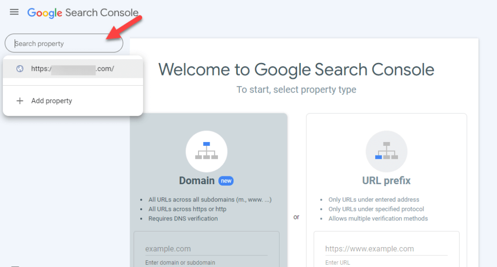
One way to access your mobile usability is through Google Search Console or GSC. Follow the instructions to access Mobile Usability Report in GSC.
Login to Google Search Console. Select the appropriate property if you have multiple properties(HTTP, HTTPS)
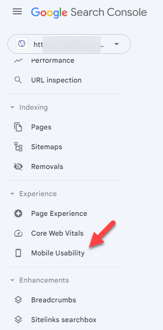
Next, click on the Mobile Usability option.
It will provide details about specific pages affected and the nature of the issues (e.g., text too small, clickable elements too close. After reviewing the report, fix mobile usability issues in WordPress.
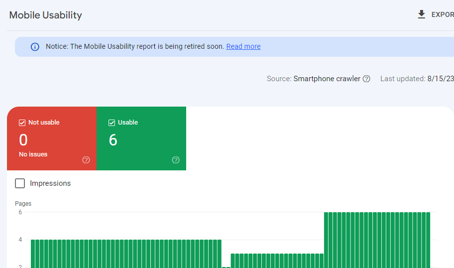
After fixing the issues, retest your website to ensure the mobile usability issues have been resolved. You can use the Validate Fix option in the Mobile Usability report to request a reevaluation by Google.
Next, let’s see the common mobile usability issues in WordPress and how to solve them.
How to Fix Mobile Usability Issues in WordPress
Now let’s look at some mobile usability issues in WordPress and the methods to fix them. Here, we will list five issues:
- Text too small to read
- Clickable elements are closer together
- Content wider than the screen
- Using incompatible plugins
- Viewport not set
Without any further ado, let’s see how to solve these issues.
1. Text Too Small to Read
You can face this issue using a font size of less than 12 pixels. We recommend you use at least 16px for font size.
To fix WordPress’s Text Too Small to Read issue, you can adjust the CSS styles controlling font size and other related properties. Here’s a step-by-step guide to address one of the concurring mobile usability issues in WordPress:
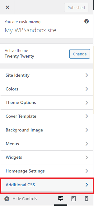
- Login to WordPress and go to Dashboard
- From the Dashboard, navigate to Appearance > Customize
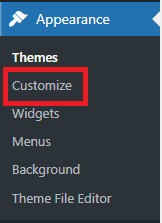
- In the Customizer, look for the Additional CSS option. This is where you can add your custom CSS code.
Use the following codes in the additional CSS to increase paragraph font size, heading font size, and font size globally.
/* Increase paragraph font size */
@media screen and (max-width: 768px) {
p {
font-size: 18px;
}
}

/* Increase heading font size */
@media screen and (max-width: 768px) {
h1, h2, h3, h4, h5, h6 { font-size: 24px;
}
}

/* Increase font size globally */
@media screen and (max-width: 768px) {
body {
font-size: 16px;
}
}
Paste these codes after entering your desired font size and click the Publish button. There you go!! Font size will be updated in no time.
2. Clickable Elements Too Close Together
WordPress’s Clickable Elements Too Close error means links, buttons, and other elements on a webpage are too close. This can make the user experience terrible, especially on touchscreen devices like smartphones and tablets. Users might tap on the wrong option by mistake because there isn’t enough space between the elements.
When elements are too close together, it can also be difficult for users using assistive technologies to engage with the website. This error is often highlighted by website accessibility and usability guidelines: this error impact mobile-friendliness and overall user satisfaction.
To fix this error, you have to adjust the CSS styles of the affected elements to increase the spacing between them. Use CSS to add padding or margin to the clickable elements, creating more space between them.
Follow the previous steps to access the Additional CSS option.
Add these codes to the Additional CSS.
/* Increase spacing between buttons */

.button {
margin-right: 10px;
margin-bottom: 10px;
}

/* Increase spacing between links inside paragraphs */
p a {
margin-right: 15px;
}

/* Increase spacing between navigation menu items */

.nav-menu li {
margin-right: 20px;
}
After adding the CSS, preview your website to see how the changes affect the spacing between the clickable elements. You might need to adjust the values in the CSS code to achieve the desired spacing.
Once satisfied with the changes, click the Publish button in the customizer to save your changes.
3. Content Wider than the Screen
The Content Wider than Screen issue in WordPress occurs when the content on a webpage exceeds the width of the screen or viewport. This problem usually occurs on mobile devices, where the screen size is narrower than desktop computers.
When the content is wider than the screen, users may need to scroll horizontally to view the entire content, which can be frustrating and negatively impact the user experience. It can also lead to issues with responsive design, making the website look broken or difficult to read on smaller screens.
There are several potential reasons why the content might be wider than the screen in WordPress:
- Large Images or Videos
- Fixed Width Elements
- Themes issues or Custom CSS
To fix these mobile usability issues in WordPress, follow the given steps.
Step1: Identify the Pages
First, log in to Google Search Console and click on the mobile usability option under the enhancements menu. You can find the issue status as the Error in red color. Once you click on it, you will see the list of URLs having issues. Now click on any URL to diagnose the problem.
Step2: Do the Mobile-Friendly Test
Now paste the selected URL into the Google mobile-friendly test tool. Wait until the tool completes the analysis. After analysis, you will find the issues with suggestions to fix this error.
Step3: Give All Images a Max Width of 100%
Image width is another common issue that might result in a poor browsing experience. Sometimes, the larger images in width make the users scroll horizontally. Users don’t want to rotate their phones to look at a specific picture—wide images force users to do so, resulting in a bad user experience.
Core Web Vitals report can catch this issue and display it as a wider-than-screen error in the mobile usability report. To avoid this error, you can add the following code in the stylesheet to apply it to all images.
img {
max-width: 100%;
display: block;
}
Step4: Use Flexbox CSS Layout
Many website designers still use floated layout models with two columns. But the problem with this model is that visitors must browse horizontally, which shows as an error in the GSC reports.
Instead of adding a scrollbar, you can use the Flexbox CSS layout model to set a specific width percentage for the container. Using the Flexible Box Layout module will create a flexible, responsive page that will pass the Core Web Vitals test.
Step 5: Media Query Breakpoints
You can also add necessary breakpoints to make your content look good on your mobile screen. You can use the following media queries for the narrow and the wider screen.
@media (max-width: 500px) {

}
@media (min-width: 501px) {

}
After all the changes you want, upload the CSS code to the website.
4. Using Incompatible Plugins
This error occurs when a plugin is incompatible with mobile web usage. It means these plugins are using some old technologies like Silverlight or Flash. To resolve this issue, follow the given guidelines.
- Identify the incompatible plugins and deactivate these plugins one by one to see if the problem disappears.
- Search the WordPress plugins directory for each suspicious plugin. Check compatibility with your WordPress version. Plugins should be compatible with the latest WordPress version.
- Ensure that all your plugins and WordPress core are up to date. Outdated plugins can lead to compatibility issues.
- Try a similar plugin if a plugin causes compatibility issues and no updates. Remove and deactivate the incompatible plugin.
- Before updating or installing plugins on your live site, try them in a staging environment. Staging environments are precise duplicates of your site where you can test compatibility without affecting the live site.
- Aggressive JavaScript or CSS modification settings in caching plugins or optimization tools can raise compatibility issues. To test the problem, turn off these features.
- Replace incompatible plugins with new plugins that use modern web technologies like HTML5.
By following these guidelines, you can fix mobile usability issues in WordPress occurring because of incompatible plugins.
5. View Port Not Set
Viewport defines how to set the page size to fit the screen size. Viewport not set is among WordPress’s top mobile usability issues.
In this issue, the website may not display correctly on mobile devices if the viewport meta tag is not set. That can lead to inconsistent layouts and poor user experience. You must fix this issue to optimize your website for different devices, particularly mobile devices.
To fix this problem, follow the given steps:
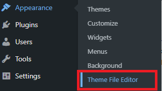
- Login to WordPress and go to Dashboard
- Navigate to Appearance > Theme File Editor
- Find the header.php in the theme files and the viewport meta tag
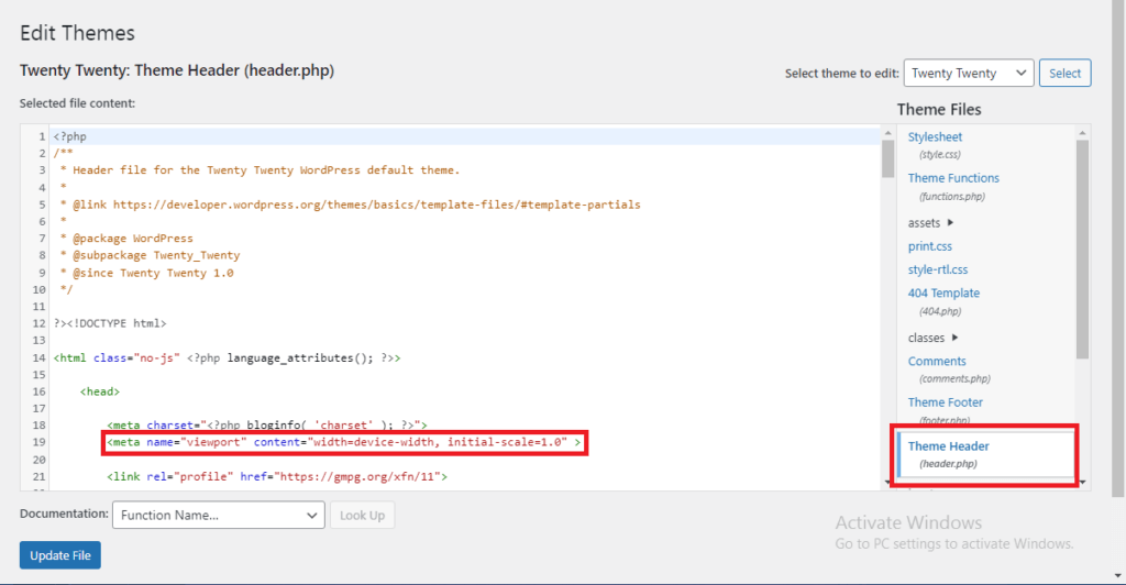
The shown meta tag tells the browser to set the viewport’s width to the device’s width and the initial zoom level to 1.0. It ensures the website adapts to the device’s screen size, providing a responsive layout.
Click on Update File once done, and you will have a mobile-friendly UI.
How to Validate Fixes?
After all the changes you have made, it’s time to check that issues are resolved and that your website is functioning correctly. To do this, you must tell Google about the fixes you have made.
To do this in Mobile Usability Report, click on the error you resolved and click on Validate Fix button. You have to do this separately for each mobile usability issue. However, Google might take some time to recheck them and give you its verdict.
Conclusion
That’s it, folks, for this article. If you need to improve the user experience on your WooCommerce store or WordPress site, you should fix all the mobile usability issues.
In this article, we have discussed different mobile usability issues and methods to fix mobile usability issues in WordPress. Here is the summary to fix mobile usability issues in WordPress.
- Choose a responsive theme and optimize images for mobile devices.
- Implement CSS media queries to adjust layouts, font sizes, and spacing.
- Use the viewport meta tag to ensure proper scaling.
- Test on various devices and browsers, checking touchscreen interactions, navigation, and form functionality.
- Address load times and monitor mobile analytics for insights.
- Gather user feedback to refine the mobile experience.
With these steps, your website will offer visitors an enhanced mobile usability experience. All the methods are easy to follow and don’t need any technical knowledge.
Have you faced mobile usability issues in WordPress?
Tell us in the comment section below.
